Creating a brand from scratch meant every element had to be intentionally crafted to resonate with the target audience. The challenge was to strike the right balance between honoring traditional coffee heritage and presenting a bold, modern face that stands out in a competitive market. Naming the brand required cultural relevance and marketability, while the visual identity needed to feel authentic and inviting.
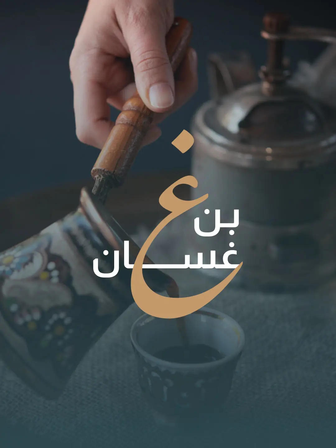
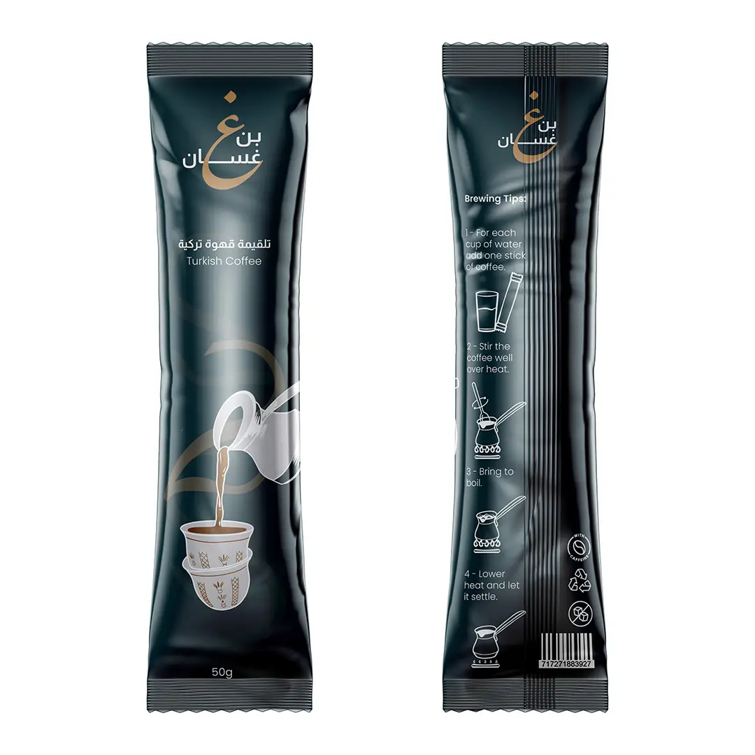
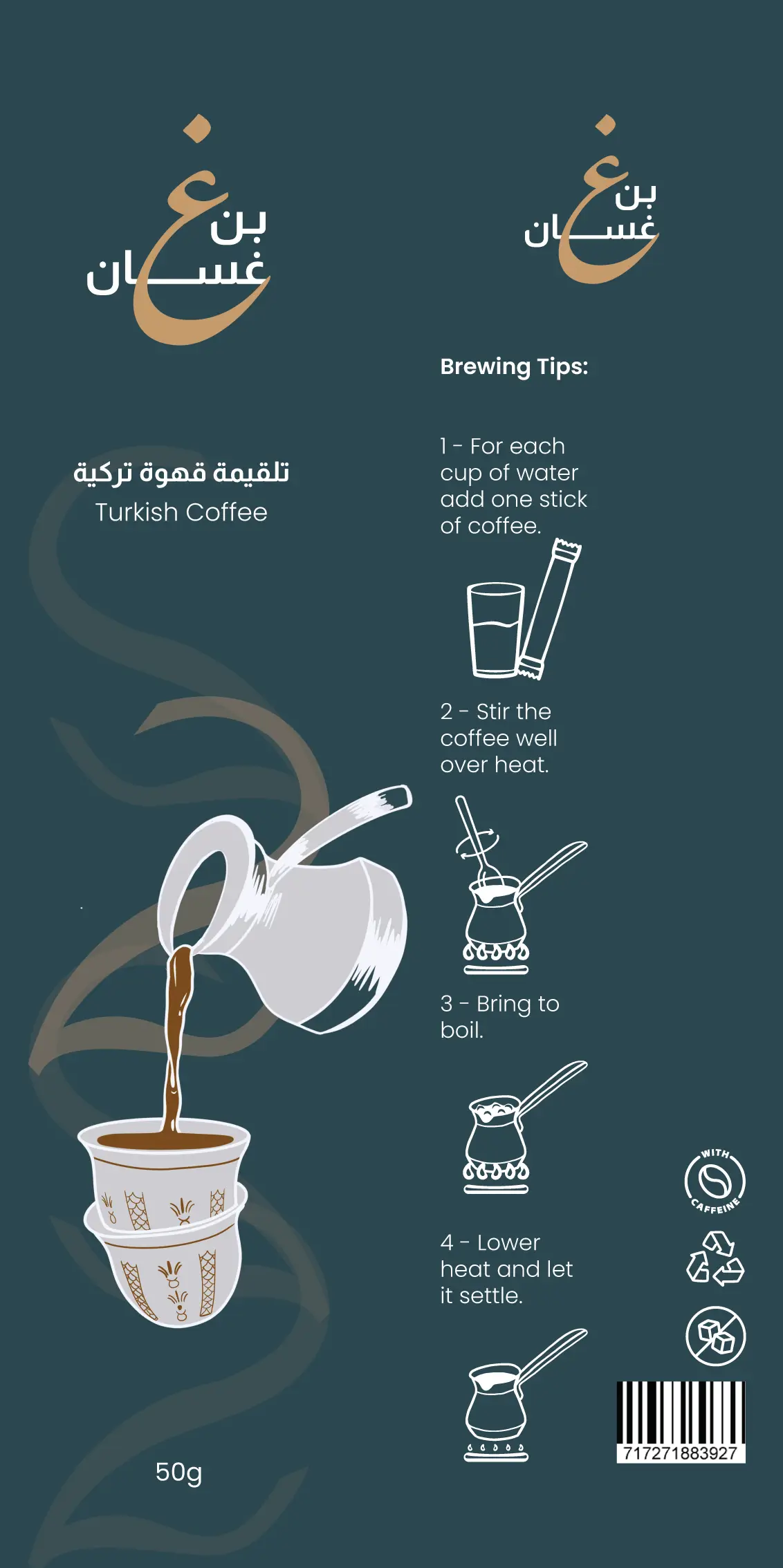
We began with strategic research into cultural symbolism and consumer perception, which led us to the name “بن غسان”—a name that evokes both authenticity and familiarity. The logo was designed with clean lines and Arabic calligraphic influence, reflecting sophistication and trust. Packaging was thoughtfully developed to be eye-catching yet rooted in tradition, while the stationery system was aligned to maintain visual consistency and brand personality across all formats.
The result is a brand that feels both grounded and distinctive. “بن غسان” quickly carved out its own space in the market, thanks to a strong, coherent visual identity. The packaging attracted attention on shelves while maintaining cultural integrity, and the logo established immediate brand recognition. From product presentation to business communication, every element contributes to a unified, professional brand that customers remember and trust.